
What Designers Do

The other day, my buddy Nichole sent me a great quote by Jeffrey Zeldman that’s right on the money:
“Content precedes design. Design in the absence of content is not design, it’s decoration.”
This idea has been bubbling up for a while—probably since I started working for a decent-sized company with a lot of sales, field, and channel marketing people who are each working furiously on their own projects to create leads that convert to sales.
“Hey- can you make this pretty for me?” I hear that question almost every day. While I’m flattered that people think I can make something look good, there’s a bigger issue.
Designers (at least the ones I know) aren’t trained in “decoration.” We’re trained in making things work—weeding out the unnecessary, the confusing, and the vague. We specialize in creating the elements that tie communication together to make a compelling finished product.
But to be effective, this process requires involvement of the designer from the beginning. When a project is started by simply identifying a problem and then running headlong into the “obvious” solution, it rarely becomes more than a one-off piece with a short life and small impact.
Quality requires asking the right questions, playing devil’s advocate, and candidly exploring the problem with a full range of possible solutions. I’ll be first to admit designers don’t know everything—but they generally do have good questions to ask and good ideas about forming solutions that will connect with the customer.
If you’ve already come to your conclusion and just want it to “look pretty,” any employee with Adobe Creative Suite might be able to give you what you want. But be aware that you’re probably not giving your project a fair shake, and you’re not being as effective as you could be if instead you would involve your designer(s) from the start.
Designers don’t decorate—they make things work.
Mere decoration has no real power to improve sales or build a brand. Solid design strategy does. But if it starts at the last 10%, it’s not strategy—it’s an afterthought.
October 9, 2009 Comments Off on What Designers Do
Cutting Corners Erodes Freedom and Stability. Here’s my solution.

If you’re like me, you find it pretty unbelievable that people will cast a vote for someone or something without knowing who or what they are. The fact is, though, that it happens all the time. In elementary and middle-through high school elections, in college, and continuing on to local and national politics.
So it shouldn’t be surprising that the same thing goes on in Congress nearly every day on incredibly important issues. After all—to these people, voting is just business as usual. Pick a “side and glide,” I call it. Sure it’s lazy, but at least it looks like things are getting done.
But here’s the difference: we elect and pay (and give incredible health care benefits) our representatives with the expectation that they will take the necessary steps to become informed on:
- The issues
- The sentiment of the people they represent in relation to those issues
- The laws and guiding principles of the country that should influence those issues
Why do we pay people to do this? Because although it’s imperative that the process take place, we just don’t have the time to do it ourselves.
As a remedy for our lack of time and expertise, we as citizens, delegate our voting authority to elected officials so that the necessary time and attention will be given to important matters that may affect our lives for years to come.
So when I hear that sides are being taken and votes being cast on issues and bills that haven’t even been read, as a citizen, I feel ripped off. Worse, I feel defrauded by the very people trusted to handle the job.
Would you invest your money with some dude who doesn’t watch the markets, who decides (based on nothing more than the name of the stock or bond) that he’ll just throw your money at this one or that one and hope for the best?
Would you send your children to a doctor who doesn’t bother to read patient histories, who doesn’t examine the symptoms, and who doesn’t even ask the simple yet vital questions like “where does it hurt?”
This shortcutting—voting without first understanding the issue you’re voting on—isn’t just lazy and irresponsible, it erodes freedoms by transferring power out of the hands of the people and into the hands of politicians who, without proper oversight, create or tear down laws that will inevitably affect the populous. So if politicians aren’t looking out for the best interest of their constituents, who will? Who can?
The Solution
It’s pretty simple:
My Congressional Deadbeat Remedy Act would require congresspeople to have read any piece of legislation in full before casting a vote. Although reporting would be based on the honor system (despite my suspicion that DC is void of any actual honor these says), each would be required to verbally confirm whether or not they read the legislation before casting any vote.
Instead of a simple “Yea” or “Nay,” a vote would be cast like this:
“I, Rupert Rawlings, have read this bill and cast my vote against.”
or
“I, Nancy Pansy, have not read this bill yet enthusiastically, and with great emotion, cast my vote for.”
Here’s the kicker: If a representative doesn’t read the bill, he can still vote. That vote, however, will be counted at 50%.
Think about how this approach would incentivise representatives to provide time for, and to actually read the bills that they seem so passionate about.
If you care about the issue, you’ll do your homework and come prepared to cast an intelligent vote. If you don’t, take the 50% and rely on your colleagues to do their jobs for you.
It’s not a perfect solution. I doubt anything can really cure the human condition of laziness and blind dis/obedience—especially in politics. But it’s clear that we would all benefit from representatives who, instead of cutting the corners, read the bills and ask the questions including “where does it hurt?”
September 24, 2009 6 Comments
Snow Lepoard’s Blue Glow
Snow Leopard is great. I installed it yesterday and everything worked perfectly—somehow I even got around 20GB of space back though they advertise only 6-7GB. I think that’s partly due to the fact that I used Migration Assistant to transfer from my old MacBook Pro to my new one. But with the combination of upgrading and cleaning out old files from Migration Assistant, I recaptured around 90GB of free space. Not bad for $30.
So- only two complaints:
- “Leopard” is an incredibly difficult word to spell
- Selected windows in Exposé now have a blue glow that melted one of my retinas
What you probably didn’t know is that John Harmon*, a designer who was laid off at Microsoft in Q4 of 2008 was hired by Apple to their OSX design team in May of 2009. His first assignment was on Snow Leopard, and tasked with creating a way for Exposé to more easily indicate which window was about to be selected. And the Blue Glow of Death was born.

Seriously, I’m surprised Apple gave the go-ahead on the glow. It’s not that big a deal, but it doesn’t match anything else in the OS and just feels strange. And since I couldn’t really stand it, I bet it makes you squirm a little bit, too.
So here’s all you need to do to fix it. You can design your own “glow,” or just download and use mine. They’re just two really simple PNG files. I didn’t get too creative because I just wanted something simple and background-ish, but you could probably come up with some pretty cool effects by experimenting. I created two sets. They’re very similar, but you might be able to tell a difference if you click to enlarge:
Thin Bright:

This theme makes the window highlight just one size.
Download Thin Bright
and Hefty:

This theme has both a large and small window highlight size.
Download Hefty
To swap these for your Blue Eye-Burning Glow, just go like this:
- Click on Macintosh HD
- Click on System
- Click on Library
- Click on CoreServices
- Right Click on Dock
- Select “Show Package Contents”
- Click on Resources
- Find and delete “expose-window-selection-big.png” and “expose-window-selection-small.png”
– you will need to authenticate (using your log on password) - Drag your new images (Thin-Bright, Hefty, or your own) in to replace
– again, you’ll probably need to authenticate - Log out (or restart if you want) and then log back in to activate your new eye-pleasing Exposé selection windows
That’s all there is to it. Hope you found it helpful. If you mess around and decide to create your own, feel free to post ’em here, I’d love to take a look.
*Technically, I made that Microsoft John Harmon story up, but it’s the only thing that makes sense.
September 6, 2009 4 Comments
Adobe Creative Suite Packaging Through the Years
I’m working on the marketing for an upcoming product version release and have been checking out what other companies are doing with their product branding. Adobe stuck out as a good example since they offer individually branded products that are also sold bundled into a suite.
They do a great job of incremental change and keeping brands related yet distinct. The packaging evolution of Adobe Creative Suite and Photoshop:

Notice the change in point-of-view between CS and Ps (you can see it better if you click to enlarge). The Photoshop packaging comp is viewed from just a little bit lower than the Creative Suite packaging. Seems kinda weird…but since it’s consistent across versions, I wonder if there’s any reasoning behind it?
August 17, 2009 Comments Off on Adobe Creative Suite Packaging Through the Years
Health Care Reform
Just a quick note here for all the people saying things like:
“The cab driver in Halifax is telling me how he had a hip & a shoulder replaced & open heart surgery. Guess how much that all cost him.. $0!”
That’s great…but who paid for it? Did Canada invent some sort of magic machine where nothing costs anything?
The reality is that he did pay for it. And so did everyone else in his country. Now, if someone asked me “Well hey—wouldn’t you help someone like that by chipping in a few dollars? Or are you just a cold, heartless jerk?” I’d say “Sure, I’d be more than happy to donate a few dollars to help out someone like that.”
I bet most of us would respond the same way. Especially if we knew the person. So why not nationalize health care then?
It’s the being forced to help out ALL the people like that that rubs me the wrong way. It kinda adds up, you know? And when someone is suddenly entitled to your service (or your pocketbook), doesn’t that take a big chunk of the joy out of service? Can compulsory service actually be called service anymore?
I got back from a trip to Europe last week traveling on trains, staying in hostels and at friend’s houses. Most of them liked to talk a little politics, and they were surprisingly on the same page in their opinions. Almost all said they like President Obama. But universally, they said they would rather have America’s health care system than their own.
So who would you trust? Someone who’s lived with nationalized health care and it’s consequences (and wishes they didn’t), or someone who wants national health care because the idea of free health care for everyone sounds like an awesome idea?
Yes—we need health care reform. But before you go holding up Canada or the UK or France or any other country with government-run health care as some banner of an ideal health care system, consider the big picture.
I realize I’m simplifying a bit. But what would be great would be to take a deep breath (+ enough time to look at a variety of options and their intended and unintended consequences) and form a solution that actually moves our health care system forward.
Because I’d rather not be covered than be covered in crap.
August 13, 2009 3 Comments
What Our Ailing Banking System Needs

This (I assume temporary) job posting for “Humor In The Workplace” is exactly what the Department of the Treasury and Bureau of the Public Debt need. Forget auditing the Fed, accountability, or common sense. What we need around here is more HUMOR!
Someone who can:
- “Create cartoons on the spot about BPD jobs,”
- Demonstrate why “humor is one of the most important ways that we communicate in business and office life,”
- But who will “refrain from using any foul language during the presentation.”
If you’re planning on applying, you should note: “Responses to this request must be submitted no later than 2:00 p.m. ET on July 6, 2009.” It’s a shame this was posted on July 9th—they might have had more applicants if they would have advertised the job before their application deadline.
Folks, this is your tax dollars hard at work. Money you are actually paying to the government.
Do people realize we go to work every day—not just to provide food and clothing and other things we want and/or need—but for incredibly useful stuff like this? No wonder we also have the awesome idea that allowing the government to run our health care would be the greatest thing ever. I mean just look at the awesome schools we have. Our effective prisons. The wonderfully efficient Medicare/aid programs. And all the free money we’re going to get never going to see from Social Security when we retire!
It seems to me that rather than hiring a Humor in the Worlplace Czar, we could just sit back and enjoy the biggest joke in the country: our government spending programs.
July 16, 2009 Comments Off on What Our Ailing Banking System Needs
When you’re hot, you’re hot. Until you’re not.

Image courtesy of here
UPDATED BELOW
When you’re hot, you’re hot—but when it comes to technology, don’t expect the honeymoon to last.
Twitter and Facebook should take a lesson from MySpace: Sell when you’re hot. The media spotlight and the technological/interfacical advantage won’t last forever.
A couple cases to back me up on that:
- Remember eBay? I know GM wants to start selling cars on there…but traffic (no pun intended) to the site keeps falling. In fact, it’s dropped 32% over a year ago. Part of that is probably due to the economy, but when was the last time you found a good deal—and bought something worth more than a few dollars on the site? When I thought I had, I found out I’d been had.
- Remember when MySapce was the coolest thing ever? Then Facebook came along. Now MySpace usership has capped off at ~125 million and Facebook doubled to 200 million in one year. Then there’s the fact that they just laid off 30% of their workforce. And while MySpace is still bringing in more advertising dollars than Facebook, their revenue is expected to drop this year as Facebook’s climbs. How long will MySpace hang around? I don’t know, but I’m pretty sure it’s no longer an appreciating asset.
Remember when Facebook was offered $1.6 billion by Yahoo? They should have taken it. Facebook isn’t going to be the latest and greatest forever, and when that’s discovered, they won’t get that 20 billion or whatever it was Mark was looking for (latest I saw was a 3.75 billion valuation).
So what I’m saying is Facebook is great, Twitter is awesome. But when someone offers you billions of dollars for a few years of work…you’re usually the one getting the good deal. Take the money and move on to the next project. It’ll probably end up being the next big thing that overtakes your last big thing.
Agree? Disagree?
UPDATE:
The New York Times reported today that Facebook investor Digital Sky Technologies is offering to buy shares at $14.77, valuing the company at $6.5 Billion. Adam Ostrow pointed out on Mashable that the valuation puts Facebook ahead of CBS in value. If that’s what people believe, now seems like the perfect time to sell.
July 13, 2009 2 Comments
FixOutlook.org: Best Use of Twitter to Date

FixOutlook.org, a service provided by Campaign Monitor / the Email Standards Project, is the best use of Twitter I’ve ever seen in my life. The site has only been up a few hours and already over 4,000 people have tweeted to let Microsoft know they’re disappointed.
A little background: Microsoft have confirmed they plan on using the Word rendering engine to display HTML emails in Outlook 2010.
This means for the next 5 or so years email designs will need tables for layout, have no real support for CSS and lots more ugly technical stuff. Want to see why it makes web designers cringe? Here’s the same email in Outlook 2000 & 2010:
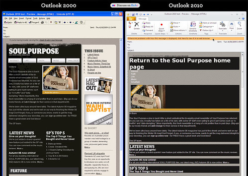
Basically, the purpose of fixoutlook.org is to tell Microsoft (since they’ve apparently been living under a rock for the last 10 years) that the design community knows they’ve been living under a rock for the past 10 years. And maybe if they know that we know, they’ll come out and see the light.
It’s a long shot…but if there’s even a chance that someone at Microsoft will just realize that they’re really making themselves look bad, it’s worth the shot. And if they actually make the logical changes to Outlook 2010 that will allow for email styling to begin moving beyond tables etc., I’ll buy you all a PC with Windows 7 and Office 2010.
So. Even if you’re not a designer, do what you can to help the rest of us out. You’ll get your twitter avatar on the page, and you’ll get to see a really cool Twitter integration—all you have to do is visit the site and click the nice big orange button.
June 24, 2009 Comments Off on FixOutlook.org: Best Use of Twitter to Date
SodaSamurai.com

Just a quick note about a little business I’m a fan of*. One of my new favorite hobbies is checking out lesser-known sodas. I’ve mentioned www.sodasamurai.com a few times and some have asked what it’s all about, so here’s a quick rundown.
The site offers a huge variety of specialty sodas that you won’t find at your local grocery store. Drinks like birch beer, ginger beer (for people who are either crazy or Bermudian and like that sort of thing), various creme sodas (including blue, vanilla, orange, etc.), some great grape sodas, and of course root beer. The shipping is very fast (mine only took two days)—and there’s nothing like a big box of liquid refreshment sitting on your porch when you get home after a long day at work.
Due to the fact that they sell specialty drinks, and that the safe shipping of liquids in glass bottles is a long ways from “media mail,” the sodas are a bit more expensive than what you’d find in the grocery store—but about the same as you’d pay at a vending machine. And it’s worth mentioning that SodaSamurai has the best prices you’ll find anywhere online.
So for the summer BBQ, friendly gathering, or other special event—it’s well worth it to stock up on some of the good stuff.
*In the interest of full disclosure: The owner of SodaSamurai is a friend of mine and I helped him with some of the site design. But even if I hated the guy, I gotta say he carries some awesome drinks. I recommend checking out the RootBeer Sampler. Just be sure to watch out for that dreaded root beer belly.
June 9, 2009 Comments Off on SodaSamurai.com
Review: The New Macbook Pro

Oh, the glare.
Earlier on Twitter, I mentioned that “I just laid the smack down on an Apple Macbook Pro product survey.” Since then, a few people have asked for the details. Despite my best efforts to keep this blog free of any fresh content, 140 characters just wasn’t going to cut it.
First I have to say that I do love this lappy and would buy it again if I had it to do all over again. But having spent a couple of years on the old MacBook Pro, the new one seems like a small step back to me.
Here were my gripes:
- The Screen: It’s floppy. As in: it nearly closes if moved around or used at an incline (on your lap if your legs aren’t straight out, in bed, etc). At first I thought this might be a problem with my specific unit, but after checking out others, it seems to be a weak hinge used on all new MacBook Pros. It’s not a huge deal, but makes the product feel quite a bit cheaper than the older model.
- The Trackpad: While I liked it at first, it takes too much pressure to click, is too loud when clicked, and is a little tricky if you don’t pay close attention to where you let your fingers rest on the lappy. With all the sliding, pinching, flipping and clicking, chances are good you’ll have your fair share of what I call the “Phantom Taptm” Again, not a huge deal here and I like the concept, but it needs some refinement. A better option might be to keep the button (sensitive only to a click and not merely touch) and and add a clickable track pad.
- The Power Adapter: The magnet in the MagSafe power adapter isn’t as strong as on the older model. At first I thought it was in my head, so I did a side-by-side test with my old model. I’d say the new magnet is about 2/3 as strong as the old one. It’s not a big difference, but it is noticeable and if you’ve enjoyed the old MacBook Pro, you might feel like Apple is beginning to skimp on the details.
- Mini Display Port: Then there’s the issue of using an external monitor. They got rid of the DVI output port, and replaced it with a Mini DisplayPort. I didn’t even think to check that in the purchase process, so I was surprised when I went to hook up to an external monitor and couldn’t. Gotta buy an adapter for that. Also, if you’ve got a 30″ Apple Cinema Display, don’t expect your new MacBook Pro to power it. Gotta buy a $99 adapter for that, too.
- And finally my biggest beef: The Screen. The 15 Inch model “features” a glossy display with no option for matte. What a huge mistake. Don’t believe the salesgeeks when they say “It’s really not an issue—the screen is so bright that you won’t have a problem with glare unless you happen to use it sitting out in the sun.” Ok…but most people who buy a laptop WILL use it while they’re sitting out in the sun. For many, the reason we buy a laptop is so that we can move the computer out of the dark cube or office we normally work in to somewhere where there’s some natural, healthy light.Notice the glare on my screen in the photo at the beginning of this post. I didn’t take the shot to with this intent, but realized after the fact that it does a good job illustrating my point.
There’s a lot of glare—and I’m indoors. Yes, the blinds are open, but it’s around 6PM and the sun is completely on the other side of the house. Similar problems with glare occur if you happen to be in a room where there’s a light on (which yes, if you’re a computer geek is probably so rare an occasion that you’ll never have to worry about pesky glare on your shiny new screen).
Honestly—this is a huge deal for me. If you’re a designer, you’re probably going to be frustrated by glare on more than just the odd occasion.
So. Those are my complaints. In all, probably no deal breakers. Like I said—I’d buy it again if I had to—but does this feel like progress? Not to me. Issues like this might be excusable in a regular MacBook, but we’re talking about the “Pro” model here, and it seems to be missing some key features you’d expect in the professional field (not to mention this price range).
The good news is they sent out a survey, so it looks like they really are trying. I just hope the people who take the survey don’t look past the fact that Apple took a step back (despite making the new product even shinier than the last).
In the end, if you’re smart you’ll probably wait until the first update before buying a new MacBook Pro. By then I’m guessing some of these kinks will be worked out.
If you have any questions or comments, please let me know, I’d love to answer them.
One more note. I love Apple’s design from their products to their ads to their website. They definitely subscribe to the popular minimalist design notion that “less is more,” and it generally serves them well. But if I had one message for them (apart from a nastygram about their glossy screens), it would be to take a page out of Milton Glaser’s book when he says “Just enough is more.”
See, when you start taking out useful or even necessary features for the sake of minimalism or simplicity, you instead end up with complexity. An adapter for this, a cable for that, and an external component for this. “Simplicity” stops being simple and becomes burdensome. For a great article on the topic, see Brent Barson’s “Simplicity is Overrated.”
Oh- one more thing. The good news is that although they got rid of that pesky DVI port, they kept the Kensington security slot for the 3 people who would die without it.
*UPDATE: I’m finishing this post the next morning. Now that the sun is up on this side of the house, the glare is so bad I can hardly see what I’m typing. But that gives me an idea for a new Apple product. As an accessory to the glossy screen on the MBP, they should sell iBlinds for people who live in houses with windows, but still want to be able to see their monitor.
*UPDATE 8/10/09: Apple listened. The 15″ Macbook Pro is finally available with matte screen again. It’s an upgrade though—yours for the low price of only $50. Seriously, it will be WELL worth the money.
May 16, 2009 15 Comments